Yard Sign Review - Tammi McKee
I've had the most requests for this one. I have received 4 or5 images of this sign from around the city.
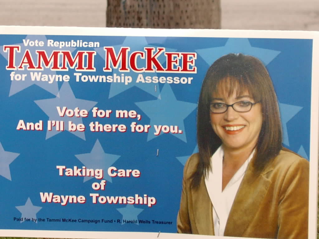
50 x 50 scanability. The type is too small. Never use a font that squeezes the name. The name should be as big and fat as possible for easier viewing.
Though the picture is nice it is distracting from the rest of the sign. A female or minority candidate can gain an advantage by having a photo of themself on their sign. But that is only so if they are running against someone of the opposite gender or race.
Clean. There are 22 words on this thing. Its best to keep it to around 5 or 6.
Uniqueness. Nothing really stands out as unique.
Color. Many campaigns will follow the patriotic red-white-blue theme. The problem is that those signs have problems standing out from each other. There is not enough contrast between Red type and a blue background.
Overall there is too much stuff and not enough contrast.
GRADE D
Guidelines for Yardsigns
posted by Indiana Pundit at 1:12 PM
![]()
2 Comments:
You are correct. When I was putting up my signs, I came across four or five of her signs spaced about 30 feet apart. Now, I am getting a bit older and my eyesight is not what it used to be I found them hard to read. I thought she would have been better off going with fewer signs that are larger for the same cost.
I will send a photo of front and back of my new signs when they come. I have my wires, but no signs yet. They say they are in the “mail” so to speak.
She should push up the glasses on her nose.
Post a Comment
<< Home