Signs for Mike Sylvester
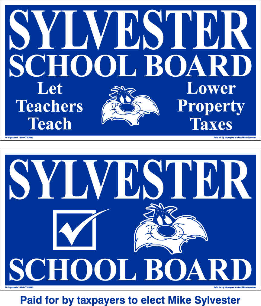 50 x 50 scanability. It only passes this test because the candidate's last name is at the top of the sign and take up the whole width.
Clean. There's too much stuff on the the sign. I would have gone with just the candidate's name, office, and the graphic. Keep your platform for other things.
Uniqueness. Sylvester the Cat is unique and helps with remembering the candidate's name. This may be a copyright infringement though.
Color. The color is fine as the other signs are using a deeper blue or compliment it with a yellow.
Extra. Don't like the two different side thing. People will have to look at the sign twice as many times to remember the campaign than they would had it been the same on both sides.
Grade C+
posted by Indiana Pundit at 5:50 PM
![]()
2 Comments:
I think Sylvester the cat needs some of Tweety's feathers sticking out of his mouth. He already has the facial expression for it.
Sylvester doesnt have a snowball's chance in hell. His riddiculous sign further emphasizes this point. I havent seen ANY OF THE SIGNS out around the NACS area. He's a joke and he's gonna loose BIG.
Post a Comment
<< Home